This was a project completed with my partner at Primer Stories — Joe Alterio. We shared all creative duties collaboratively. We worked with web developer Michiko Swiggs to bring the project to life.
The International Committee of the Red Cross had a tough mission for us — create a rich media microsite as a compliment to their report on war in urban environments. The ICRC knew that these types of reports don't often generate a lot of causal readership, so we knew that we'd need to create a piece that was engaging, regardless of the readers' familiarity with the subject matter. The website would be an engaging piece of visual storytelling for a broad audience, while at the same time serving as a top-of-funnel experience for more focused policy workers.
The source report was a heavily researched, 65-page PDF about refugees in Syria, Iraq, and Yemen. We worked with the ICRC to pull out salient points and structure the story, as well as providing a visual environment in which the story could come alive and convey a sense of the drama felt by the victims of the crisis. We'd also provide a download opportunity for policy workers and other interested parties to obtain the full report.
The first thing we needed to do, before doing any visual work, was to really figure out what the story was and how we'd structure it. We dug into the report, identifying three main beats that could serve as tentpoles for the story — the scope and scale of the crisis, cities' new role in armed conflicts, and the fallout from this situation. Structurally, it felt as though we were making a rough-cut shot list for a documentary.
With the documentary feel in mind, our initial thoughts of the UX landed on making a series of "scenes", lightly animated, that would draw in the reader and reveal more parts of the stories. In the brief, it was mentioned that because reader's bandwidth may be limited, or they may be viewing the site on mobile. Because of this we determined that a single, "scrollytelling" site would be ideal, since it would avoid having to navigate among and load multiple pages.
We blocked out where some of the story beats could be enforced with imagery, and where we should keep it dialed back and let the powerful-first hand stories do most of the lifting. After a few rounds of paper sketches we began with digital wireframes.
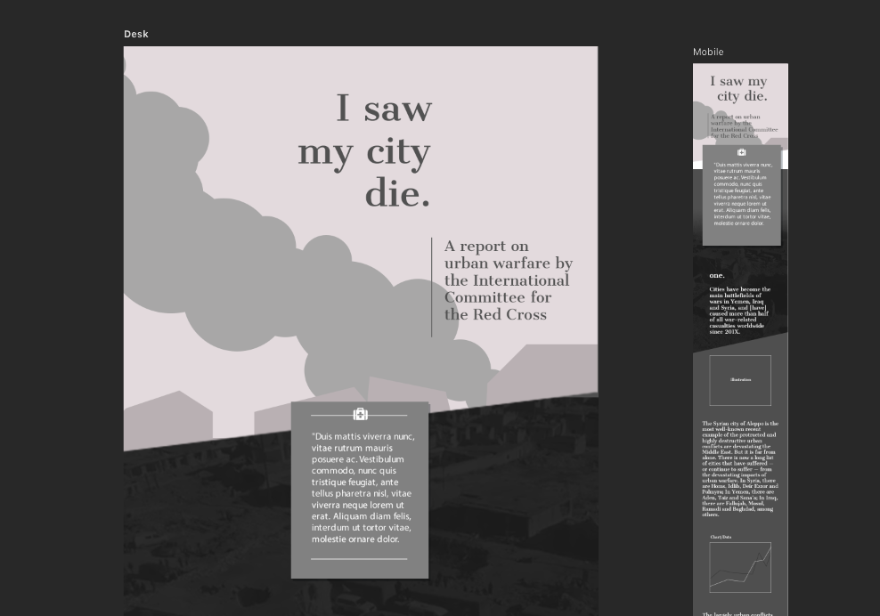
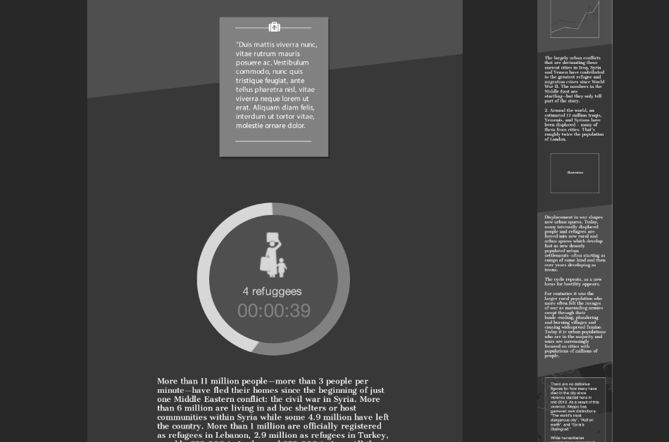
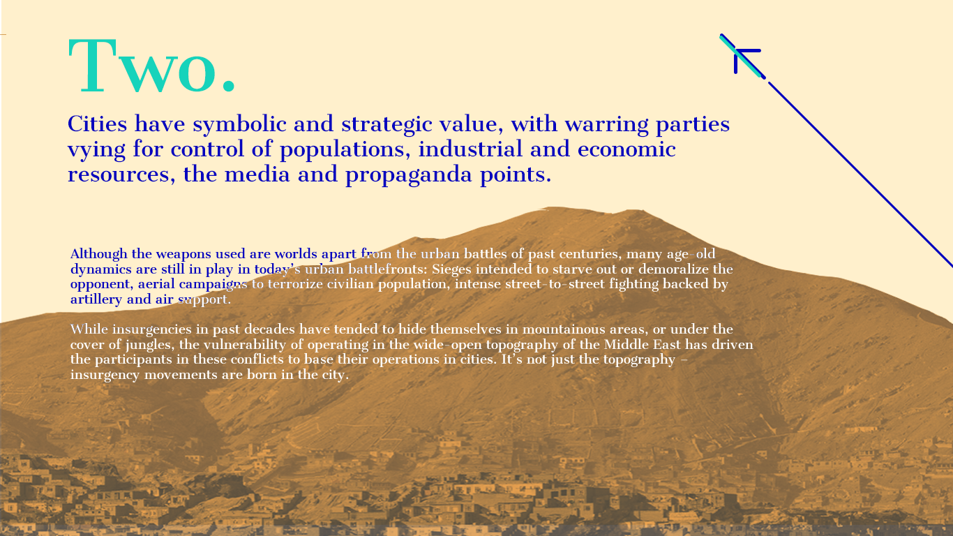
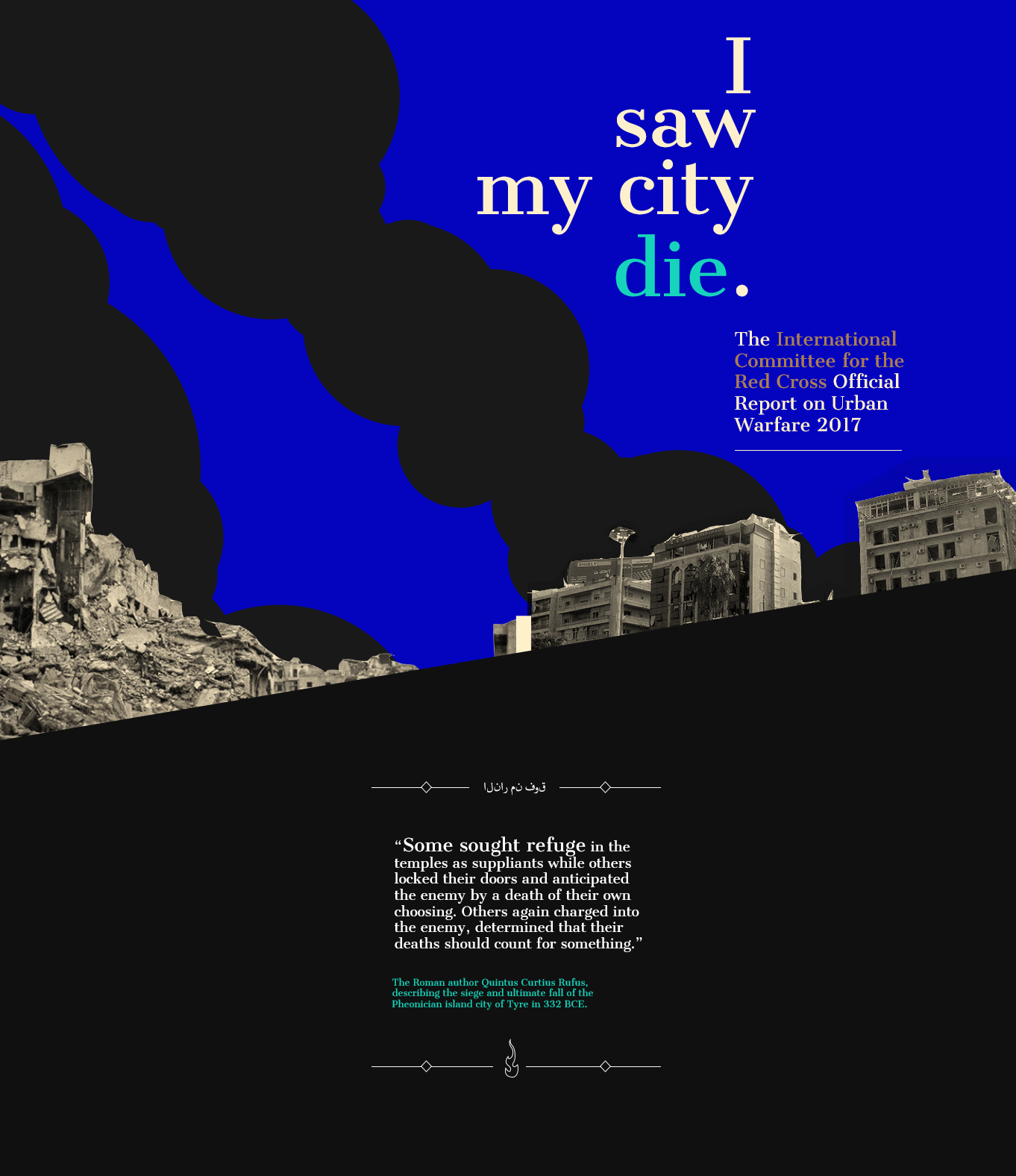

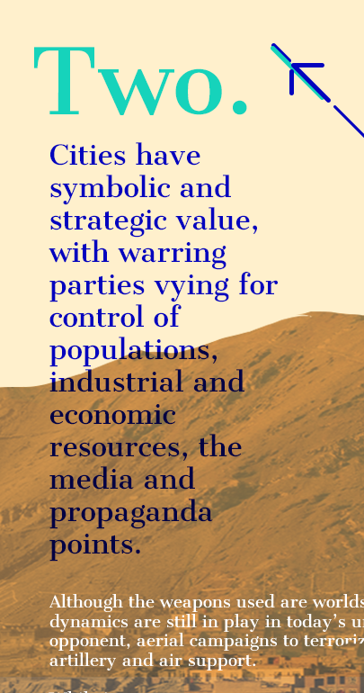
In the wireframes, we gradually added more fidelity, using the opportunity to test out a range of aesthetics and graphic treatments.
We knew that animated components can be powerful storytelling tools, and that they would help us engage a broader audience. Because of the bandwidth limitations on the site, we determined that SVG (scalable vector graphics) animations would be a perfect approach, so we started experimenting with what was possible. We were using an early version of Lottie / Bodymovin' to export our animated graphics from After Effects, and our developer was able to implement the scroll-triggered animations beautifully.
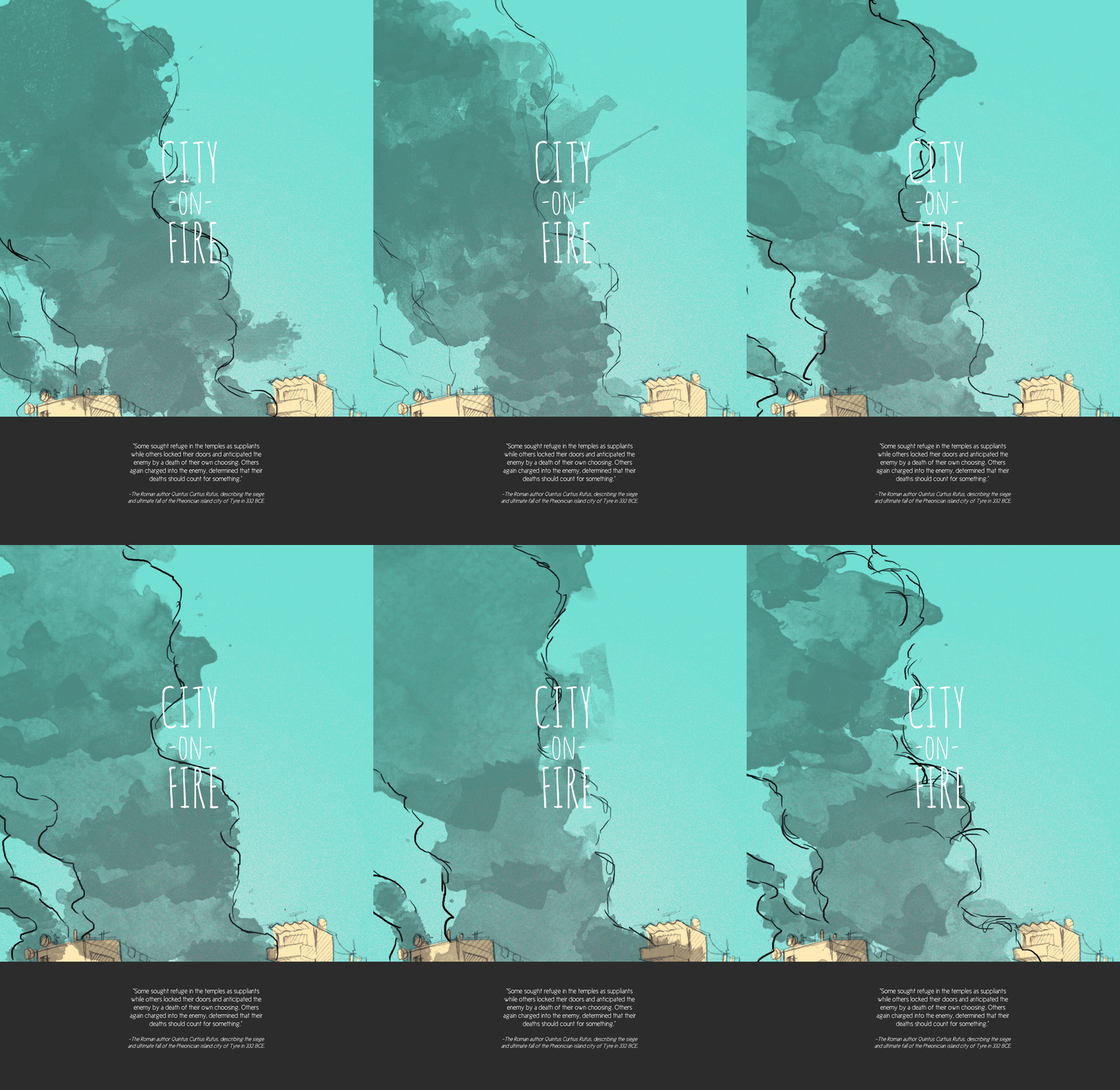
One of the greatest challenges of this project was striking a balance for the reader. We wanted to craft a piece that was engaging and drew people in, while at the same time striking a somber tone that conveyed the gravity of the situation.
In discussing this challenge with our contact at the ICRC, we hit upon the idea of implementing a "counter" that shows an ever-increasing number for the entire duration of a page visit. The ICRC knew how often families were losing their homes, which enabled us to give a real-time estimate of how many people were becoming refugees.
Implementing this feature allows for a reader who is likely in a more stable environment than the subjects of the story to get some sense of the reality of these refugees through a universally shared experience like the passage of time.
As some of the key components of our UI were beginning to take shape, we wanted to ensure the other visual assets were doing as much work moving the story forward, so we combed through countless photos and videos that the ICRC had to really identify the images that spoke most to the human story, and the particular impact on cities as the geographic center of the piece.
Through a collaborative process, we explored how those photos would interact with our animations and illustrated components and other aspects of the UI.
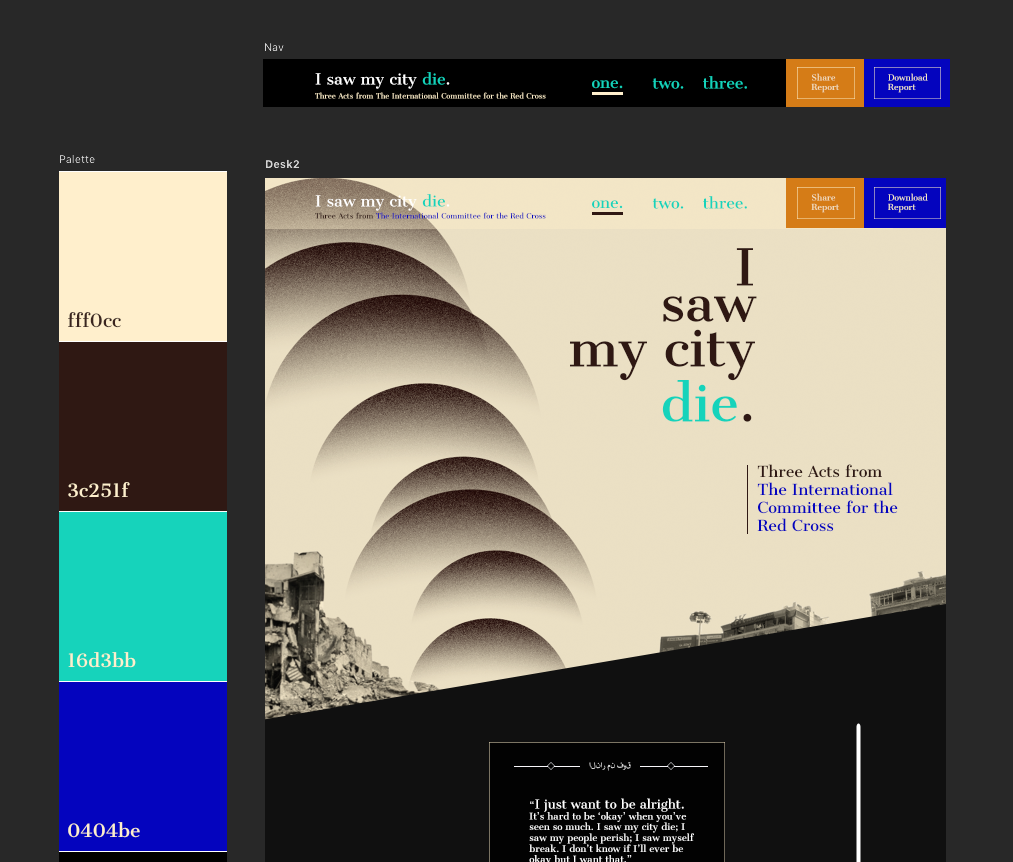
We iterated on color a lot — we knew we wanted to include a tan color that referenced the physical environment of these stories, which calls up both desert and the concrete of the buildings. We also included a subtle reference to the flags of the countries involved; Syria, Iraq, and Yemen. And we wanted some darker, rich values to help convey the weight of the situation, and a slightly brighter color to .convey a sense of hope and resilience.
As the story, copy, UI, palette, typography, photo, video, and illustrated animations came together, our piece began to really take shape. Over the course of about a month, with regular check-ins with our developer, we built the site out. We fixed UX patterns that needed improvement, dialed in animation timing, and increased legibility. We also began to implement the live Arabic translation feature that was a requirement of the project, and which had some surprising ramifications for our design, since Arabic is typically right-aligned and read from right to left.
In all, we went from text document to fully immersive, bilingual site in about 3 months. Some screenshots are included below of the final design, but it's really best experienced on the live site.
See how the final piece turned out here: cityatwar.icrc.org
