
At Primer&Co., I worked with my partner Joe Alterio on lots of visual storytelling projects. The project I designed this interactive data visualization for was about attacks on education around the world — Education Under Attack 2018
We needed to convey a range of different information types clearly, and in a small space. We wanted to make it easy for readers to compare country data, so keeping maps for every participating country in the same place became vital.
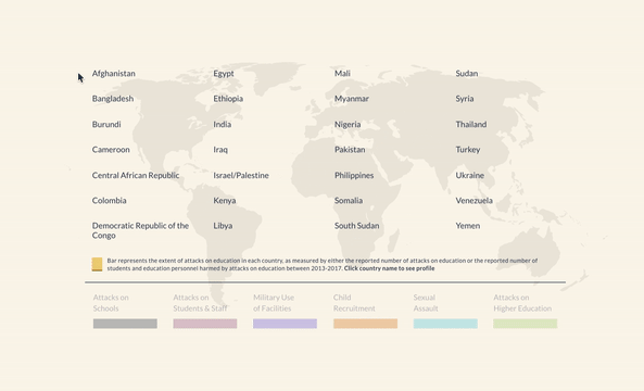
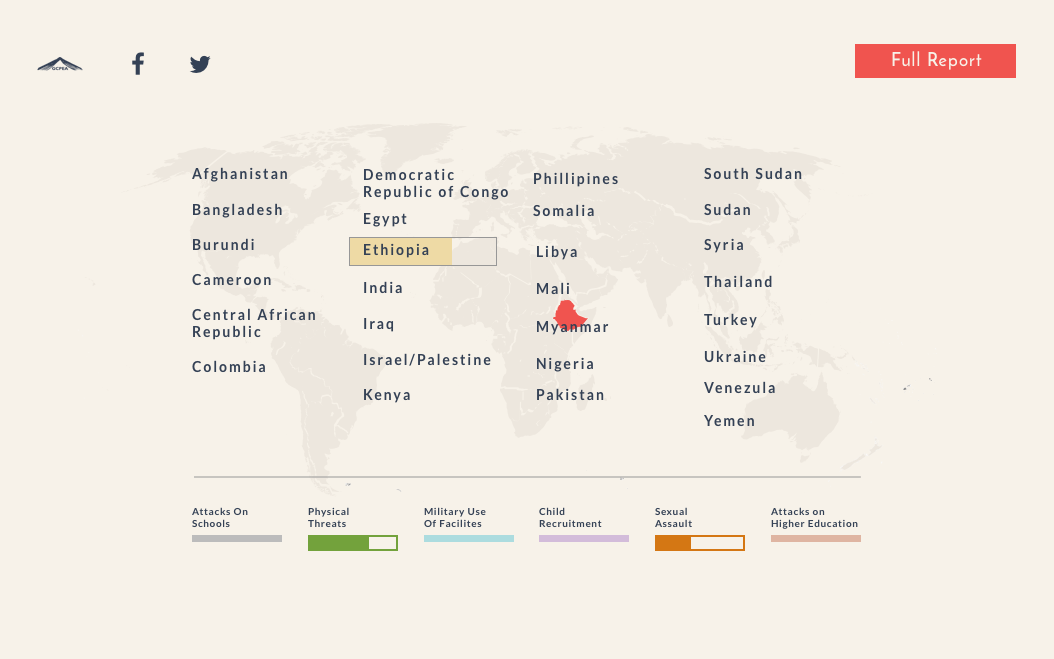
I devised the above technique that shows the following data types at a glance, all in one interactive element:
1 - The number of attacks on education in each included country
2 - The breakdown of that total, separated by type of attack
3 - A relative comparison of all countries for each type of attack
4 - The location of each country on a map
2 - The breakdown of that total, separated by type of attack
3 - A relative comparison of all countries for each type of attack
4 - The location of each country on a map
Process:
I'm proud of this solution to showing all this data in one view, but it didn't happen instantly. It was the result of many iterations.
Each country included in this interactive report has its own landing page, and we figured that the landing page would be a great place to show a map of the country, give some geographic context, and get into the stats for each country. Here's some exploration of that: 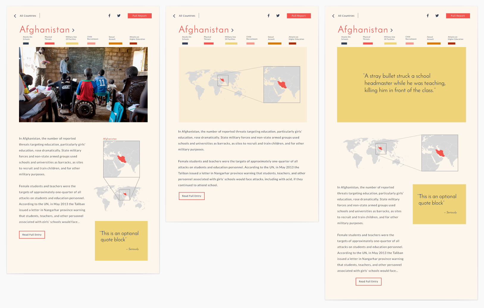
The problem with these designs becomes evident once you visit a few pages. The designs do show the unique stats for each country, but they don't leverage all the data we had available to actually draw meaningful comparisons between the countries — a reader would have to remember the stats for one page while clicking through to another, or open up two browser windows. Neither of these were acceptable.
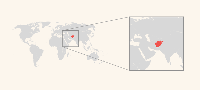
I went back to the drawing board to think about how leveraging the power of comparison could play out. I mocked up this animated rollover map that would highlight the country in question. The zoom effect wan't meaningful enough on its own to justify its inclusion, but the ability to animate the map on hover became the seed for more interesting map-related interactions.
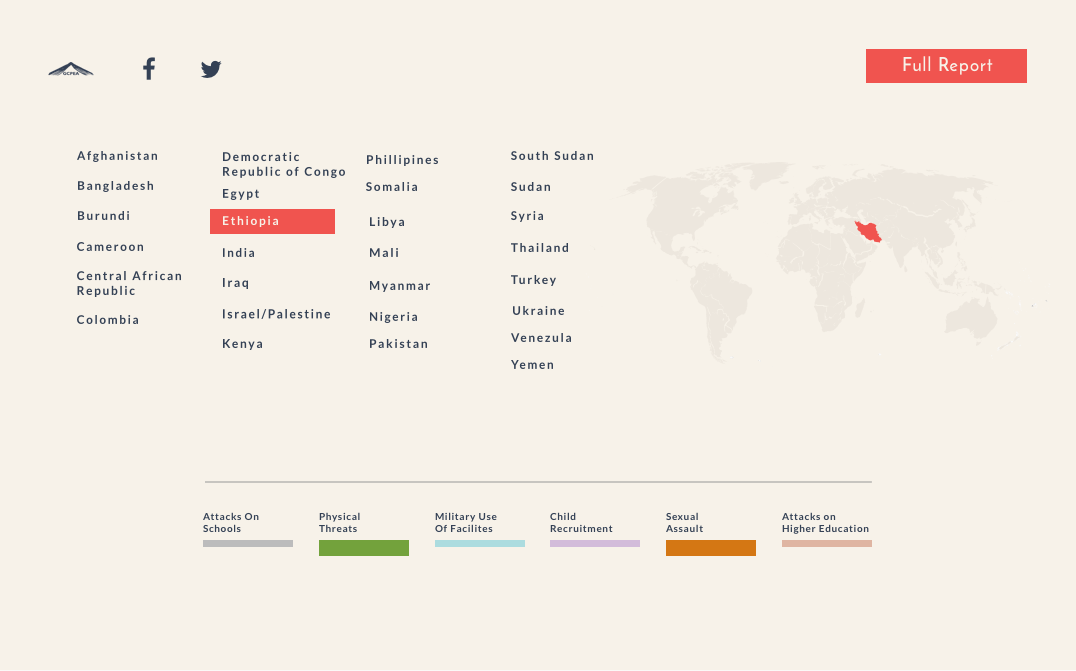
The next major milestone came when thinking about how to highlight the relative stats of the countries even more. This view allowed us to move the data comparison beyond the individual pages into it's own self-contained module. It was a big improvement, but there were some legibility issues with the country names because of their small scale, and for smaller countries in the map, their visibility was suffering.
The next step got us very close. Layering the information was what we would need to do in order to keep everything on one page and allow that easy comparison that we needed. It enabled the country names to be big, and to carry a metric in the same space that their name occupied. It also helped add some hierarchy. The map element was important, but not so important that it needed dedicated real estate.
Simplifying some UI components, making the colors more distinct for colorblind users, and making some formal tweaks got us to the final. See it in context here.